Correction never leaves the text.
A child writes, a teacher corrects, a family receives a printed book. Three uses, one thing: the child's own text. My job: hold them together without letting the product split in three.
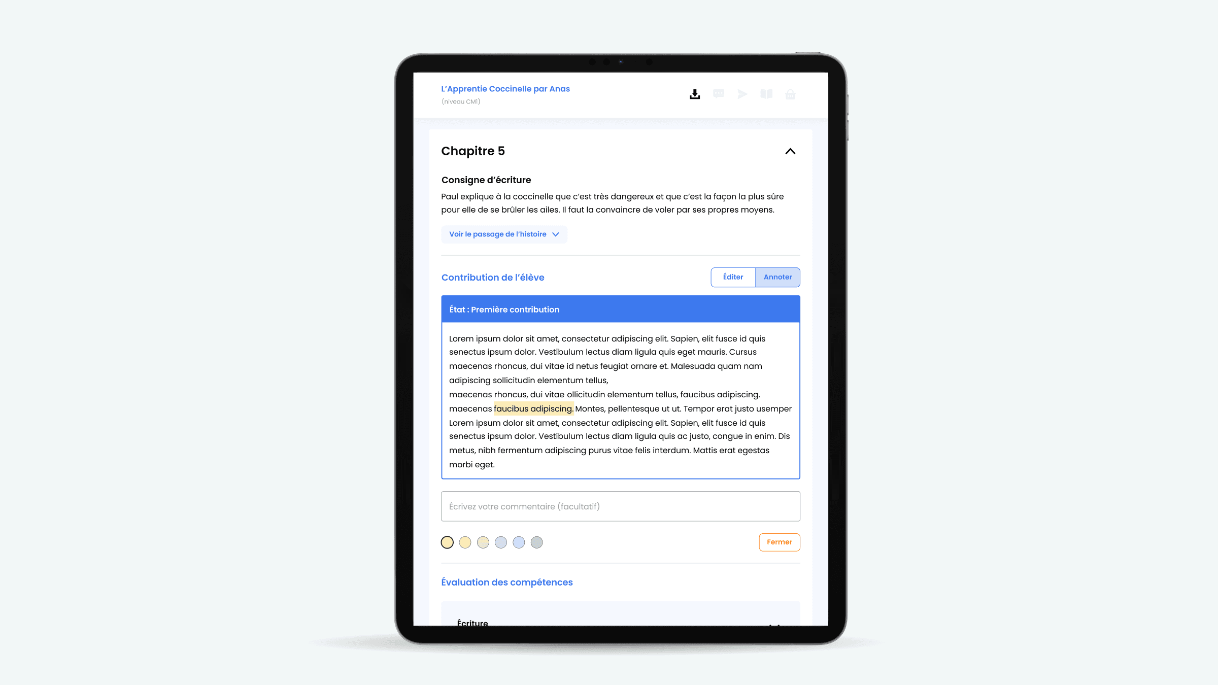
Three audiences, one constraint that will not move.
Plume is a French edtech that teaches children to enjoy writing, at school and at home. When I joined, it was no prototype: a product already used by thousands of children, backed by MAIF and Evolem, and growing fast.
I came in as Lead Product Designer on the core of the product: the write, correct, assess loop, across the child, the teacher and the family. The difficulty was never one screen, but three: three audiences with opposing needs, a ten-year-old, a teacher in a hurry, a curious family, inside one coherent experience, without ever breaking an official skills framework.
That was the problem I owned: coherence across three audiences, under institutional constraint. Towards the end of my time there, a UX designer joined to take over the research and testing I had been running.
Four principles.
Edit or annotate, never both
Edit changes the text, annotate locks it. You pick your intention before touching it.
Each side sees the other's marks
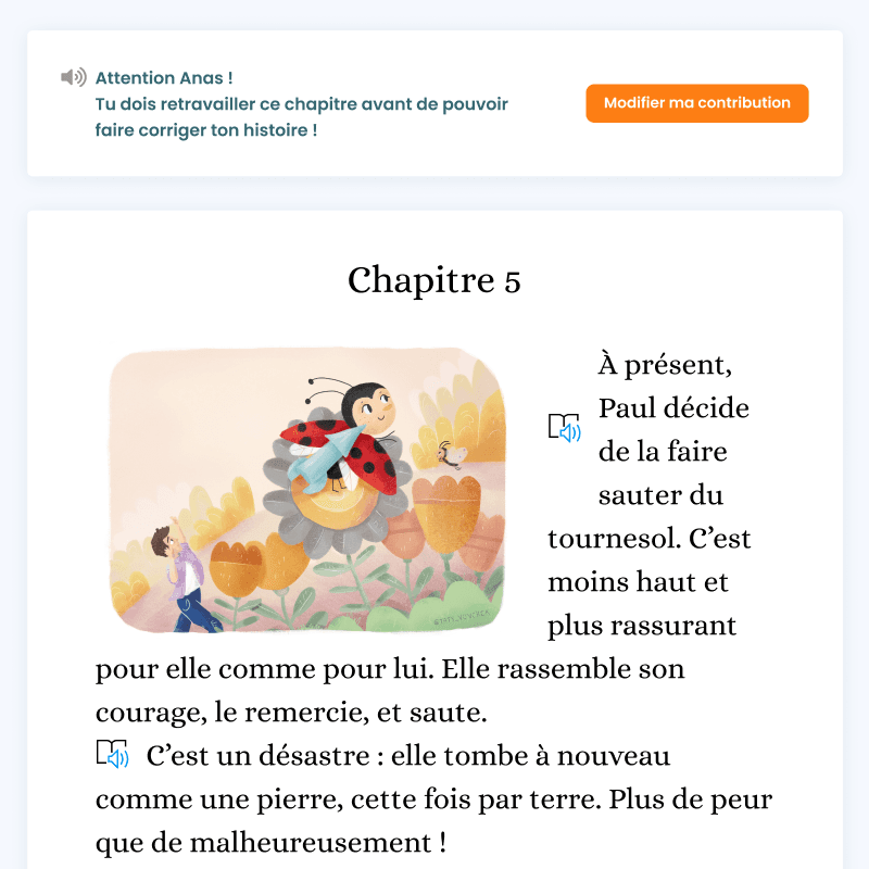
The pupil's additions in orange on the teacher's screen, the teacher's corrections in blue on the pupil's.
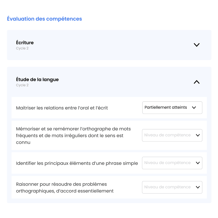
Assessment sits under the text
The official framework is filled in under the copy, without changing screen.
One lock between the exercise and the book
Until the teacher validates, the output bar stays unlit.
Focus.
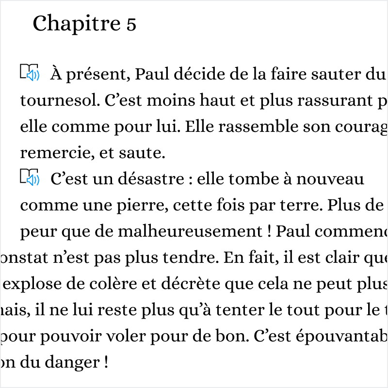
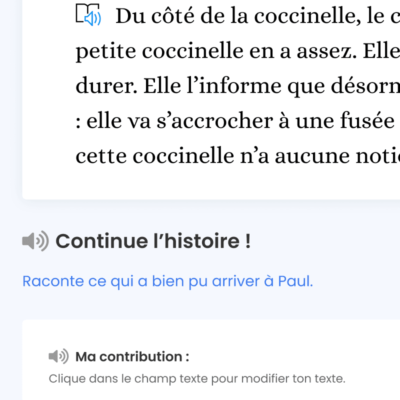
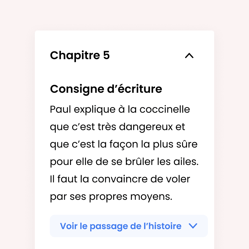
Two intentions, two vocabularies.
“Correcting a child's text means two opposite intentions.”
The switch
Correcting a child's text covers two opposite intentions. Fixing an agreement, a capital, a missing word yourself. Or asking the child to fix it. Put both in one toolbar and they never compete fairly: the faster gesture wins. And the faster gesture does the work for the child.
Two exclusive modes on the same text area, with a switch right above it. The wording follows: what reaches the child is a request, not a correction. The child gets a button that reads "Improve my text".
The mixed mode. Faster for the teacher, but it lets speed decide for them. I preferred a system that forces you to pick an intention, even if it costs a switch on every copy in a stack of thirty.
The risk was never in the toolbar
Once the request is sent, the text comes back marked on both sides. And a ten-year-old does not read a track-changes pane.
The colour code
A round of correction leaves a text covered in marks. A standard track-changes pane solves that for an office adult. A ten-year-old cannot read a colour nobody explained.
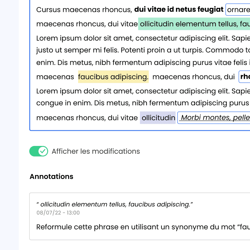
One mechanism, one colour per direction: whatever the other person touched comes up circled. And each screen carries its own legend, written in the language of whoever reads it. "The words circled in blue were corrected by your teacher" on the child's side, the parenthetical note on the teacher's.
A single universal legend. Simpler to maintain, but it would have been written for the adult. I preferred to duplicate it and own it in two registers: two places to maintain, two chances to drift apart, but neither audience reads a message written for the other. It is the translation that doubles, not the system.
One system, three sizes.
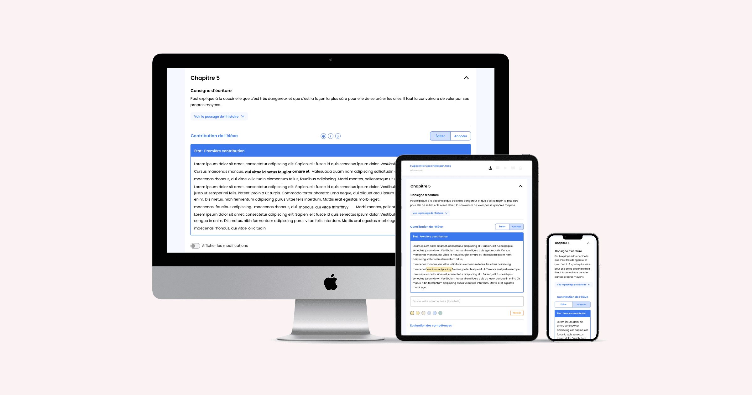
The feature ships with its components: mode switch, text options, annotation cards, sharing, toasts, dialogs. Every piece exists because a screen called for it, and the same correction loop holds at all three sizes, with no cut-down version.
What I would validate today.
Two decisions, two bets.
Here is how I would put them to the test today, and what the result would tell me.
Does splitting edit and annotate change who does the correcting?
Count direct corrections against requests sent to the pupil, before and after. If the share of requests does not rise, the switch is not enough.
Does the lock prevent premature sends?
Count the stories validated and then reopened. A lot of reopenings would mean the lock lands too early in the gesture.
The family receives the corrected story and orders the book, but it has no space of its own. And assessment stays entirely manual, skill after skill, copy after copy. Both gaps sit in the same place: where the system stops, the work lands on a person. Across three audiences, coherence never comes from the screen, it comes from the system and from the trade-offs you own.
The last line.
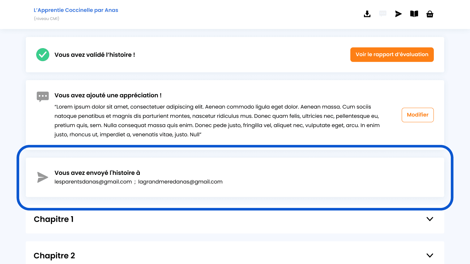
At the very end of the chain, a confirmation screen says where the story went. Two addresses: the parents', then the grandmother's. Everything that comes before exists so that a child's writing ends up with someone who will read it without correcting it.
Other projects.
Walou
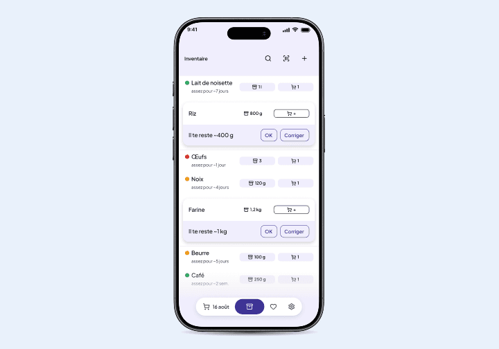
A grocery app that helps cut waste by showing what you already have at home.
View project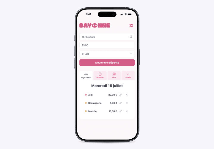
Bayonne
A shared-budget app that turns a couple's monthly budget into weekly envelopes in real time.
View project
MemenTop
An app that keeps daily life simple for people living with Alzheimer's and their carers.
View project