Accept help without handing over the keys.
A memory app that asks you to remember something contradicts itself on the first screen. A carer app that decides for you does too. MemenTop lives between those two rules.
A product that did not exist yet.
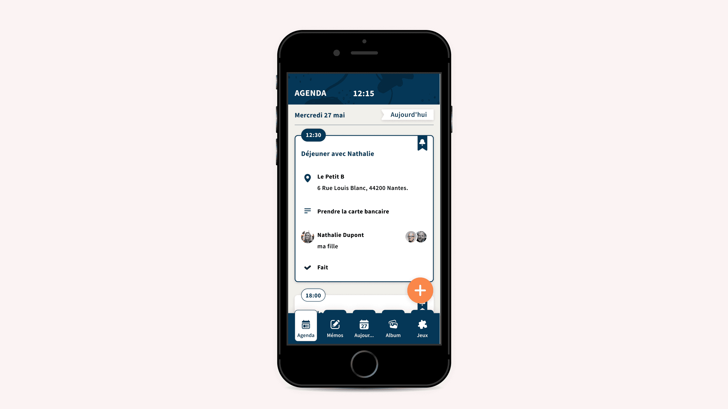
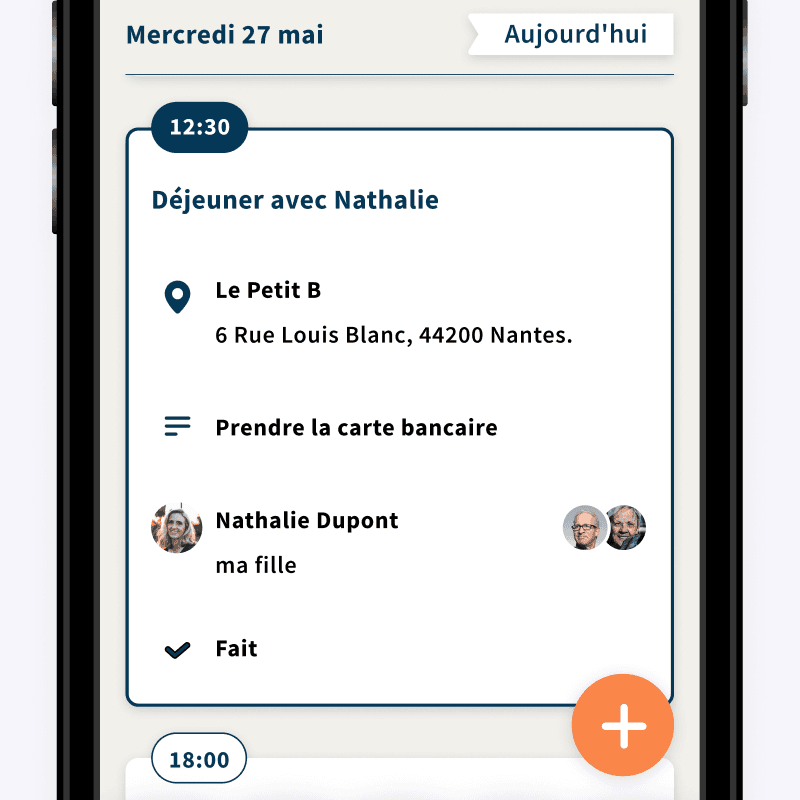
MemenTop is the product of Smart Macadam, a Nantes startup founded in 2018 around everyday memory, for people living with a neurodegenerative condition and for the relatives who look out for them. The door code, the rice cooker instructions, Thursday's appointment: the app keeps whatever matters this week in one place the person and their circle share.
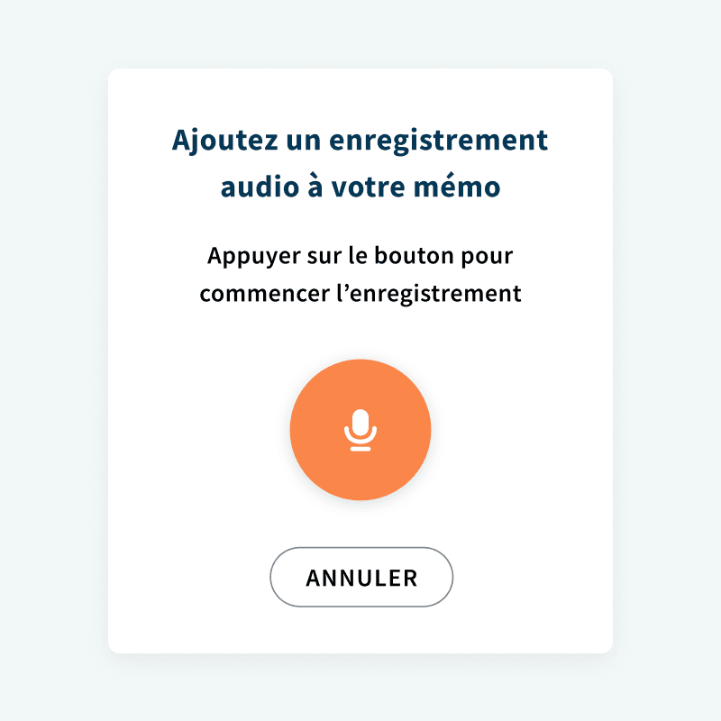
I joined as founding designer and carried the design of the product on my own, with another product designer alongside me for a few months. Nothing existed yet: no screen, no system, no user. Zero to one, from February 2020 to March 2021, across onboarding, how relatives enter the circle, the memos and how they are found again, the calendar, the album, the gazette, the games. The product went into production eight months after I left, in November 2021, with that scope.
The hard part was designing for a memory that fails without ever talking down to the person, while keeping a relative in the loop. I turned that into a rule, the same one from screen to screen: help comes in, it does not take over.
The app is not the product.
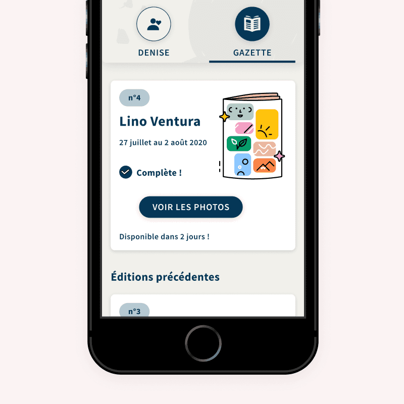
MemenTop is a three-part system: an app, a weekly gazette printed and posted, and a phone support service, for the person and for their relatives alike.
That changes what the app is for. It is not the product, it is the lightest piece of it. Whatever a relative puts into it has to hold up once it leaves the screen, all the way to a printed page landing in a letterbox. And whatever the app cannot catch, somebody catches on the phone.
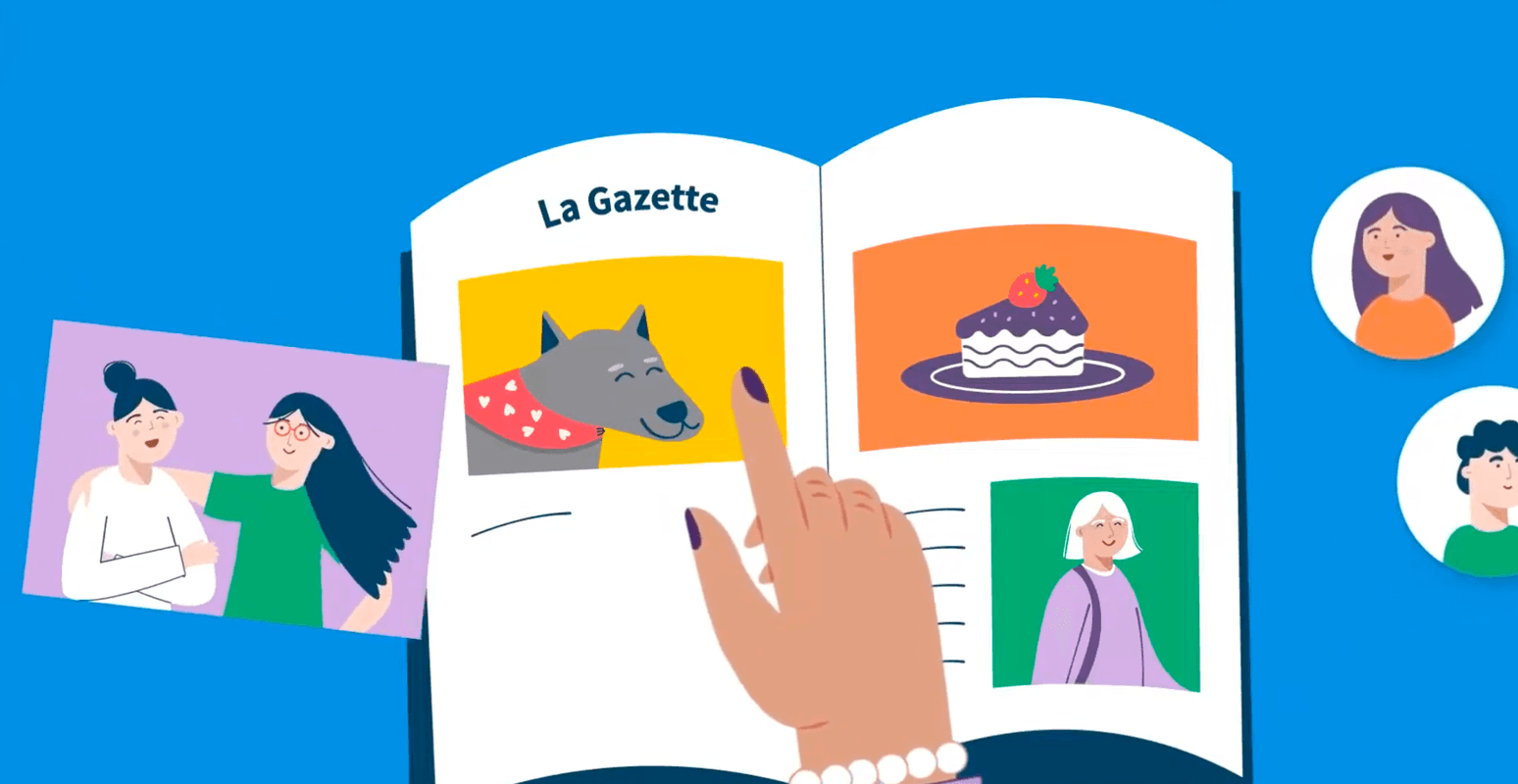
The product arrives by post
The product ends up on paper. For someone whose relationship with a screen is fading, the way out is not a better designed notification, it is an object that arrives in the letterbox.
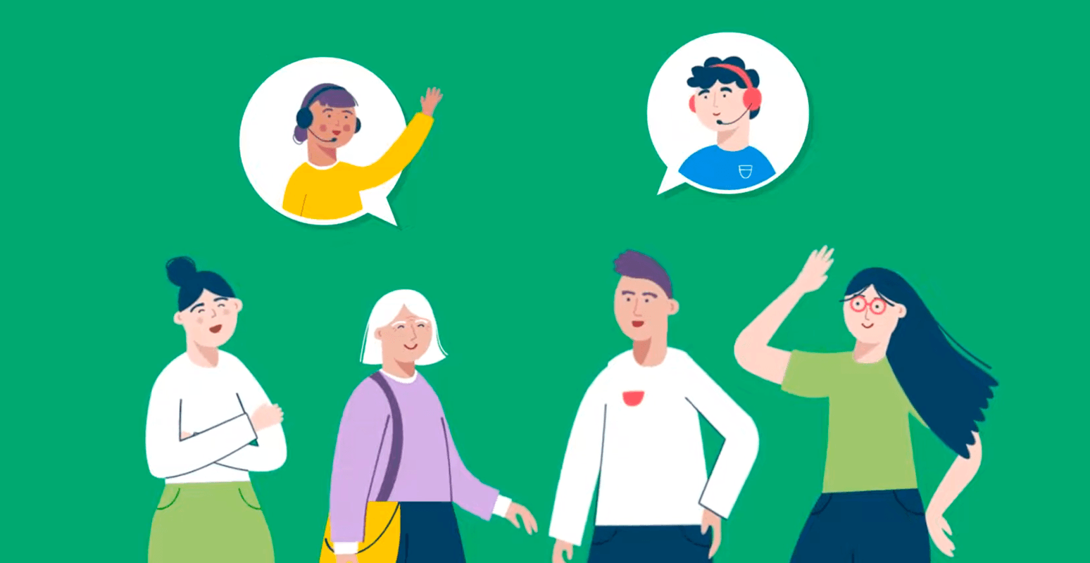
A human on the line
A human answers the phone, and that is what lets the app stop short of solving everything: what it must never do is leave someone with no next step. Inside the interface, support is not a button, it is a line in the offer, and one subscription covers the person and every one of their carers.
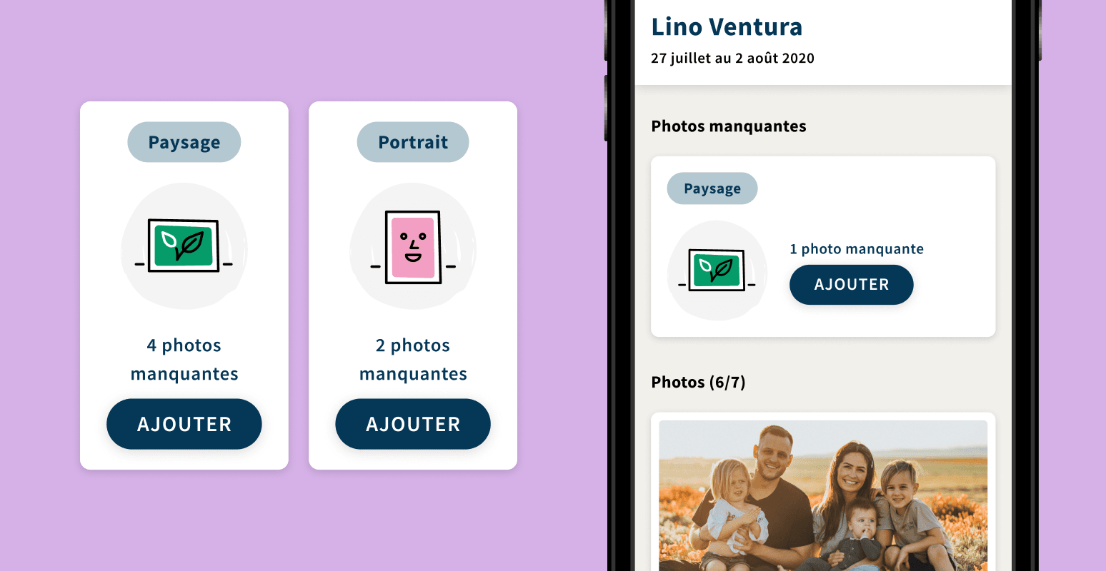
Paper drives the app
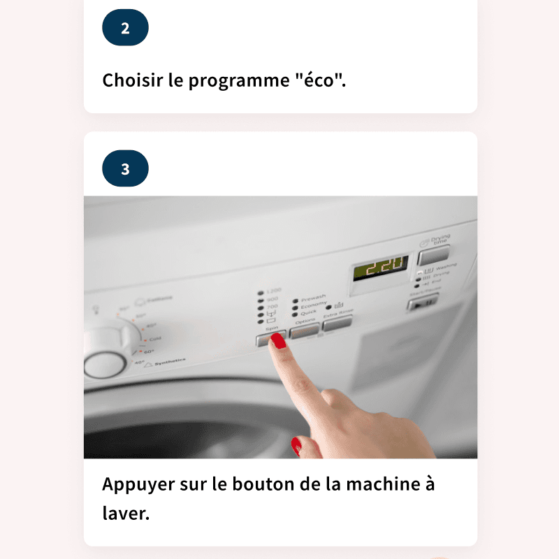
The printed layout reaches back into the phone: one photo is still missing, and it has to be landscape.
Four principles.
No password
You get in with the Google or Apple account already on the phone. Asking someone whose memory is failing to remember a password loses your user on the first screen.
No word for the illness
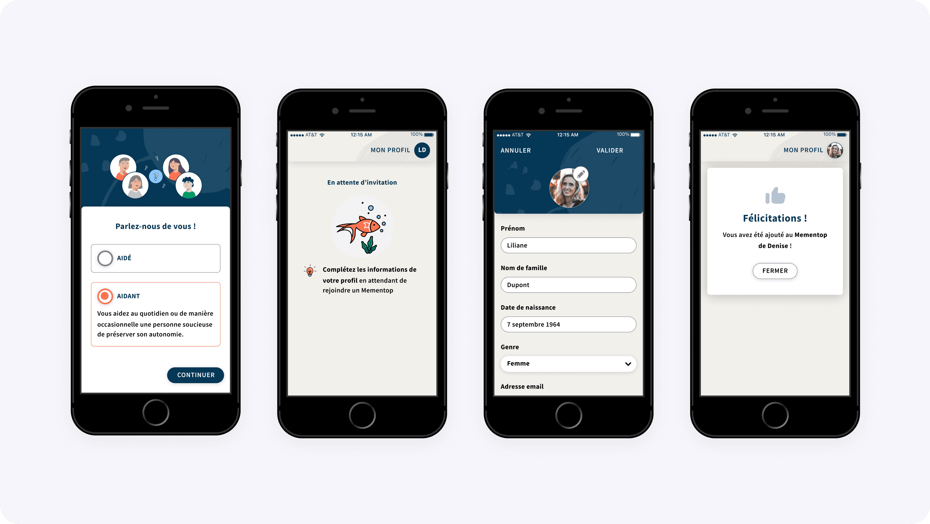
Signing up is not a choice between patient and carer. It is a choice between being helped and helping, each described by what the person does. The diagnosis stays outside.
Search does not assume you remember the title
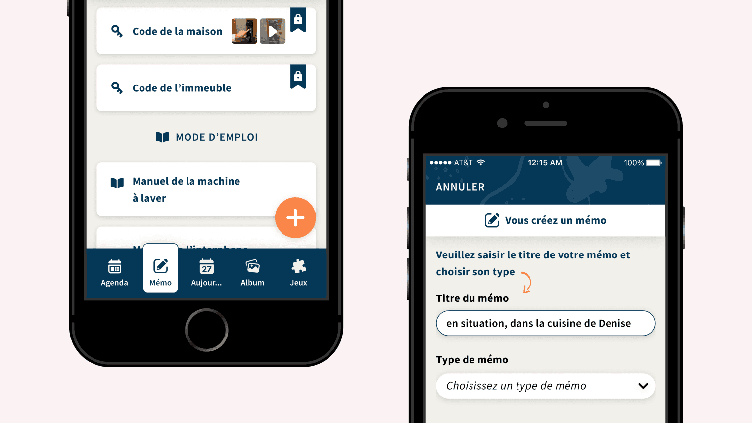
It reads the description and the keywords too. And when searching fails, the list stays sorted by type, each family with its own icon.
The score can be switched off
Every game carries its own settings: letter by letter or press and drag, visible timer, sounds, vibration, score display. A memory game that shows the points also shows the misses.
Focus.
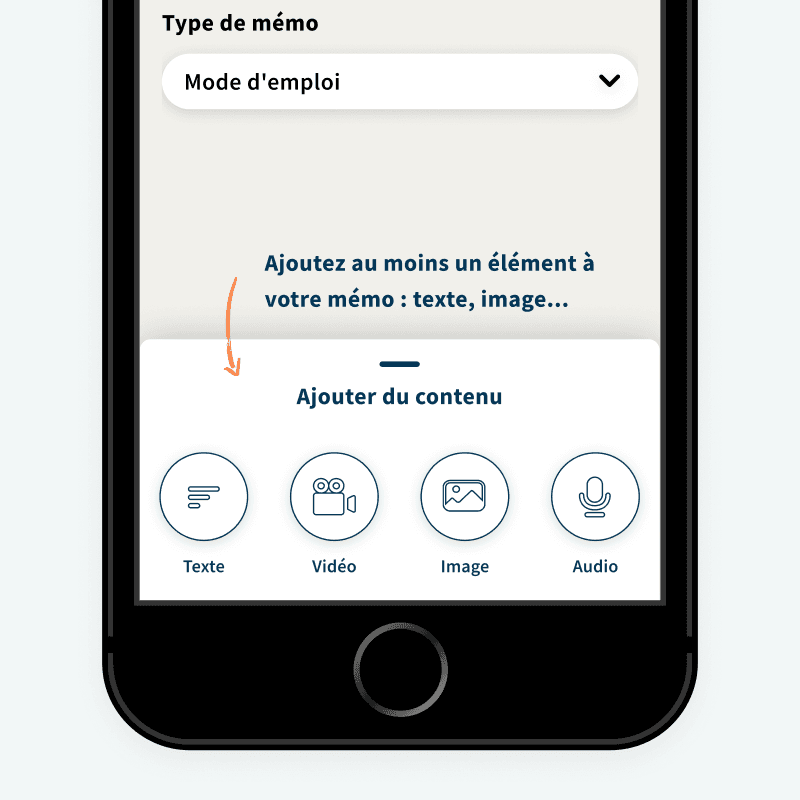
One door.
“The first screen of a carer app decides who the app belongs to.”
Bonjour, je vous invite à rejoindre mon Mementop ! https://mementop.app/link/hkkshGYjggj
Bonjour, pouvez-vous m’inviter à rejoindre votre Mementop ?
The invitation
MemenTop is useless on its own: it takes two people, the one living with the illness and someone close. The shortest path is well known, and most health products take it. The relative creates the account, adds themselves, and hands back a phone that is already set up. One step instead of three. And a person who has just had the last decision left to her taken away, the decision of who comes into her home.
The circle only opens from the account of the person being helped. The invitation goes out by text from her own messaging app, with the message already written: all that is left is to pick a number from her contacts. And when the relative is the one who wants in, the app does not add them, it drafts their request and addresses it to her. Nothing to type, nothing to remember, no code to copy across.
The admin carer shortcut. It would have spared me a waiting state to design, a link that can expire, and a relative left standing outside until somebody opens up. I preferred one single door, on the person's side of the wall.
The link
An invitation travels by text, so it lives outside the app. It can be forwarded, land on the wrong phone, or sit for three weeks in a thread nobody opens any more. Sooner or later the link stops working, and it fails at the worst possible moment: the one where somebody was actually trying to get in.
The screen that catches a dead link does not return an error, it returns the next step. It names the person to ask again and it drafts the message. The primary button reads “Send a message”, the secondary one reads “No”. Nothing to work out, nothing to copy across, no dead end.
The permanent code. A code that never expires never breaks, and it would have removed this screen altogether. But a code that never expires is a door left open: it gets passed on, written down, and never handed back. I preferred a link that can die, with a way out, over a key that never comes back.
What it saves further down
Which leaves the question of what that wait should be.
The product's life cycle.
These results belong to the product and the team, not to me. They say these screens went into production, and that they were taken seriously enough to be evaluated in a clinical study. They do not say my trade-offs were the right ones.
Shipped · November 2021
Into production, then onto the App Store and Google Play in spring 2022.
Used · 2022
1,500 accounts created, a figure the company announced a year after release.
Studied · 2022 to 2024
Entered PEDICO, an 18-month research protocol run with France Alzheimer and the university hospitals of Nantes and Angers, in two arms, with and without the app.
Wound down · October 2024
The €630k raised in 2022 was not enough. Liquidation followed, the company having failed to convince its investors to fund what came next. The app leaves the stores.
A carer belongs to one Mementop only, which leaves out anyone looking after both parents. The screens cover creating a memo with no privacy setting. Deciding who sees what, piece by piece, was still to be designed, and that is exactly where the question of independence comes back. I left eight months before the product went into service, so I never saw whether routing everything through the person won households or lost them, and that is the bet I would measure first if I reopened the product. And the app found users without finding a model. With a vulnerable audience, accessibility is not settled by type size, it is settled by who gets to decide. And a product can be right without being viable.
Four digits and a name.
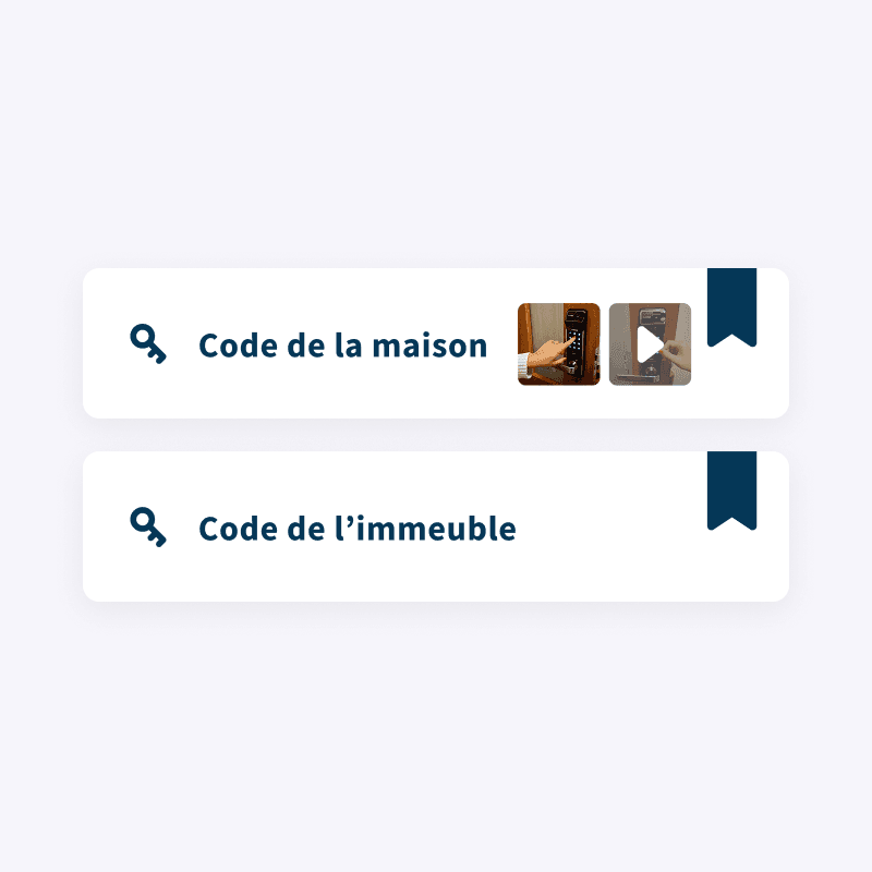
Two memo titles sit next to each other in the list: “House code” and “Entry code”. What goes first is not a lifetime of memories, it is the four digits outside your own front door. In my 2020 screens, the woman who forgets them is called Denise. The product kept that name to the end: on its own website, a relative builds her a memo standing right there in Denise's kitchen.
“I was able to work with Tiffany in particular on mobile accessibility, and we had highly stimulating and productive exchanges on a subject that matters so much for our users living with Alzheimer's.”
Other projects.
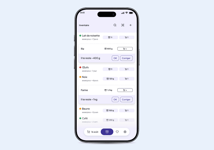
Walou
A grocery app that helps cut waste by showing what you already have at home.
View project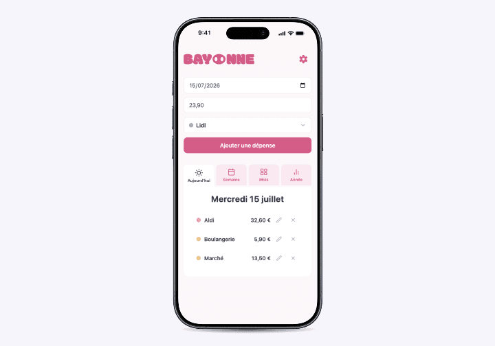
Bayonne
A shared-budget app that turns a couple's monthly budget into weekly envelopes in real time.
View project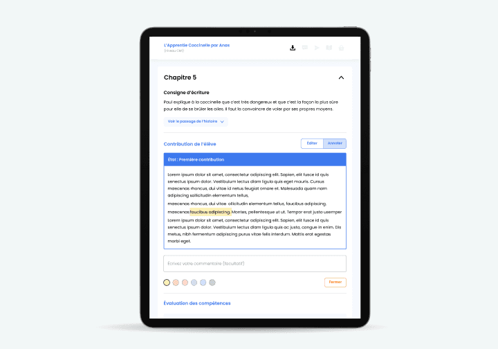
Plume
An edtech that teaches children to enjoy writing, at school and at home.
View project