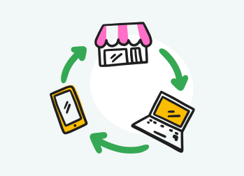
When we talk about UX, we talk about screens.
Apps, buttons, sign-up flows, checkout funnels. Conferences, newsletters, LinkedIn feeds: in the vast majority of what I read about UX, the word means digital. I haven’t measured it. I see it, week after week.
It’s strange, when you know where the word comes from.
In the early 1990s, Don Norman took the title of User Experience Architect at Apple. He chose this word because “interface” felt too narrow. He wanted to talk about everything a person goes through: the design of the object, the graphics, the interface, the physical interaction, even the user manual. Thirty years later, the word has shrunk to fit inside a glass rectangle.
But experience doesn’t stop at the edge of the screen. It continues when you walk into a shop. When you look for the exit between two aisles. When you hesitate for three seconds in front of a price tag.
I started with walls, in 2009. Store layout, scenography, visual merchandising. Screens came ten years later: first product design, then my own apps.
On both sides, I saw the same thing. The same person.
You are not a different person in a shop and in an app.
The profession, however, is organised as if you were. It’s time to sew the two halves back together.

A profession cut in two
The word travelled. It went into start-ups, then large companies, then job titles. “UX designer” became a digital job. Its tools are design software. Its deliverables fit in a browser. The training courses I see teach people to design apps.
Nothing wrong with that. Digital needed this rigour.
The problem is what the word left outside.
On the other side, there are people who also design experiences. With walls, aisles, light, shelf heights. Store planners, visual merchandisers, scenographers, interior architects. They watch where people stop, where they hesitate, where they turn back. They test, they move things, they start again. They do UX. Nobody calls it that.
And this act of designing goes far beyond our professions. The bookseller who puts new books at eye level, near the entrance, does UX. The teacher who rearranges the classroom so the pupils can see each other does UX. Nobody tells them.
The result: two families designing for the same person, with different words, different tools, different meetings. In the organisations I have known, they rarely meet. Often, they don’t even work in the same department.
I have seen it from both sides. In stores, we talked about flow, hot spots, product placement. On screens, we talk about journeys, friction, conversion. They are often the same questions. Where is the person going? What stops them? What makes them decide?
Two vocabularies for one person.
And when you design in two halves, someone ends up feeling the seam. It’s never the designer.
What the seam costs
Shop window, website, app. Three entrances to the same brand. Often, three feelings that don’t talk to each other.
The shop window promises a mood. The website speaks in another tone. The app has its own logic, its own menus, its own words. Each one was well designed. Not together.
We all know these moments. The app says the product is in stock, the shelf is empty. The loyalty card works at the till, not online. Something ordered on the website can’t be returned in the shop. And it’s not only about brands. At the council, they send us to the website. On the website, they send us back to the council.
One by one, these are details. Together, they tell a story: on the other side, nobody sees the whole person.
Because the person doesn’t change channels. They just go on with their day. They look at a product on the bus, come to try it on Saturday, order it in the evening. For them, it’s one thing, one wish. For the company, it’s three departments, three teams, three dashboards.
That’s where you feel the seam. Not in a bug. In a feeling: being known here, a stranger there.
And the seam doesn’t weigh the same on everyone. Someone with time, a good connection and digital confidence fixes it on their own. They compare, they find a way round, they get there. The person who comes by bus for a product that is supposed to be in stock loses their morning. The older person who is told “just do it on the app” is left alone in front of a screen that wasn’t designed for them.
The more time, money and digital confidence you have, the less you feel the seam. The people we forget feel it first.
So bringing physical and digital together is not a designer’s whim. It’s not about brand image. It’s about consistency for the person in front of you. About respect, even.
The profession knows this. It has even invented words for it.
The profession already has the words
Let’s be honest: I’m not inventing the problem. Others saw it before me, and they are working on it.
Service design is the most structured approach. It sees the experience as a system, from the shop window to after-sales service, with blueprints, these maps that show what happens in front of and behind the counter.
Omnichannel experience design is more hands-on. It focuses on continuity: the basket started on the phone is still there on the computer, an online order can be collected in store without problems.
Phygital comes more from marketing. It mixes technology and place: click and collect, kiosks, screens on the shelves. It’s tactical, and often effective.
Retail experience design takes store layout further, into the whole in-store experience. Finally, CX takes the customer’s point of view on their whole relationship with the brand.
The field is well documented. Researchers have studied it: in 2015, the Journal of Retailing published a special issue on the move from multi-channel to omni-channel retailing. These people are serious, and sincere. They want the same thing as me: an experience that holds together from start to finish.
So why can we still feel the seam?
Look at the vocabulary of these approaches. Channels. Touchpoints. Journeys. Systems. Ecosystems. These are plumbing words. They describe the pipes, and how to connect them.
In a blueprint, the person exists. They are even at the top of the page. The best blueprints add an emotion curve: what the person thinks, what they feel. But look where these emotions are stored: under each touchpoint, box by box. As if the person left their mood at the entrance of each channel, and picked up a new one at the next.
These approaches start from the journey. Not from the person who goes through it.
The journey is still a good tool. It’s a bad starting point.
The difference looks small. It changes everything. When you start from the journey, you ask how to move cleanly from one channel to another. When you start from the person, you ask what they carry with them from one place to the next: their wish, their doubt, their tiredness, what they have already understood. No pipe carries that. It has to be designed.
Others sew the channels back together. I prefer to start from the person who moves through them.
Start with the person pushing the trolley
The shop was my school. I learnt at IKEA, in visual merchandising, in more than a dozen stores in France.
In a store, there is a plan. A planned route, zones, a direction to follow. And then there are the people.
They take shortcuts. They go back. They stop where nothing was planned, and walk past what we had highlighted. The plan says where they should go. Their feet say where they go.
I learnt to watch feet. The person before the plan.
I learnt something else: decisions are made fast. A few seconds, sometimes. In the right place, with the right information, at the right moment of tiredness or desire. One second too early, the person isn’t ready. One metre further, they have already walked past.
On screen, I found the same person. They also go off the planned route. They skip steps, go back, give up where the metrics didn’t expect it. They also decide in a few seconds, when the information is just right.
The place changes, the tool changes. The person doesn’t.
Starting from the person means asking other questions. Not “how do we connect the app to the store?”, but “what is on their mind when they walk through the door?”. What have they already seen, understood, decided? What makes them tired? What do they need, right here, right now, in this exact place?
These questions have one strength: they don’t ask you to pick a side. They work in front of a shelf as well as in front of a screen.
This is also what democratic design taught me: a good, simple idea that can be repeated, made for the many. In my reading, it doesn’t start with the ideal customer of a persona. It starts with someone who arrives with a tired child, a tight budget and twenty minutes to spare. If the experience works for them, it works for almost everyone.
And this person never asks whether they are in physical or in digital. They only ask whether someone thought of them.
So what now?
You could think I changed jobs in 2020. I only changed tools.
The shop taught me to read feet. The screen taught me to read clicks. And each one sharpens the other. The shop floor makes me more demanding in front of a mock-up: I know there is a body behind it, some tiredness, a time of day. The screen improves how I read a space: I spot useless steps, hesitations, information that comes too late. The two don’t follow each other. They answer each other.
So, to everyone who designs something for someone, a place, an app, a service, a front desk, a classroom: which side of the door do you design from?
The person in front of you doesn’t ask that question. For them, there is only one experience.
I don’t see a problem to fix between departments. I see an invitation: to design in one piece, for someone who stays whole.
Because you don’t become someone else at the shop door. I don’t design for a shop window, a website or an app. I design for the person who moves from one to the other.