On Tuesday, I listened to three people from IKEA talk about buttons.
About contrast. About tokens. About dark mode.
I took notes like a designer. I listened like a visual merchandiser (VM).
From 2015 to 2022, I was a VM at IKEA, in store and then at head office, before managing teams. After that, I moved into product design to understand the other side: the screen.
That day, the two sides of my career talked to each other.
One question stayed with me. A design system can change the culture of a whole company.
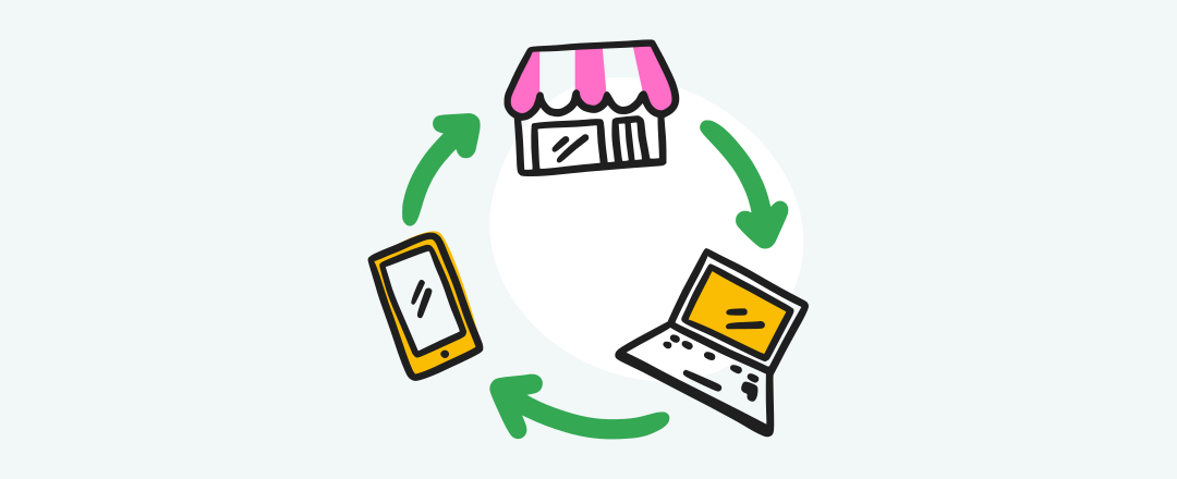
What if the store joined the circle?

A system that listens
Skapa is IKEA’s design system. A shared library of components, colours and rules. Product teams use it to build their screens: the app, the website, the kiosks and big screens in store, the devices co-workers use.
Caroline Dahl, its product owner, gave the scale. Around seven years old. 67 components. Well over 200 product teams.
What struck me was not the size. It was the loop.
Robin Whittleton, inclusive design lead, talks about a virtuous circle. Skapa makes accessibility very visible. Product teams pick it up. They test it in their own context, find new needs and share them back. The system gets better. So do the teams.
A system that learns from the people who use it. I don’t know many.
There was also this test I love. To check if a dark mode still felt “IKEA”, the team removed the logo, the product names and the well-known furniture. Then they asked people which brand it was. They also asked which words described the interface, to compare them with the brand values.
It is the test a VM does after every set-up. You step back a few metres and ask: does this space carry the brand’s message? Not only “do people recognise the brand”. More “do they understand what it wants to say”.
Along the way, the Skapa team learned to speak the brand team’s language. Since then, it has been the link between the brand and the product teams.
Context really is everything.
Pierre Orsander, designer at IKEA
A button that is accessible on a white background is not accessible on another one. The challenge of a design system, Pierre Orsander explains, is to design for a context that does not exist yet.
It shows. In 2026, the agency Level Level tested a full purchase on the fifteen biggest e-commerce sites in the Netherlands, from the cookie banner to payment. IKEA scored 97%. The best score.
On screen, the context is well handled. But for me, context is also an aisle on a Saturday at 5 pm.
One single story
Skapa makes all of IKEA’s screens speak the same language. Colours and styles start in Figma and update everywhere, with almost no manual work. The app, the website and the kiosks stay aligned.
The customer does not stop at screens. They spot a sofa in the app on the train. Look for it in the store on Saturday. Check the price on their phone in front of the label. For them, it is one single story.
Between the screen and the shelf, someone holds the thread of this story: the visual merchandiser.
Their job is to translate. They get a commercial plan: product families, priorities, a season, prices to push. They read it. Then they write it into a real space, with furniture, heights, light, walkways. The plan becomes a place. The sofa seen on the train becomes a room set you want to touch.
Translating is not copying. It takes judgement. The plan does not say that this aisle is too narrow for a pushchair. That this product disappears against the light. That people always cut through that corner. The VM sees it. And adjusts.
Pierre Orsander talked about designing for a context that does not exist yet. On the shop floor, the context exists. It is there every day. It has feet, trolleys, tired children.
VMs read it all the time. The question is what we do with what they read.
The circle stops at the edge of the screen
Skapa is already in the store. On kiosks, on big screens, in co-workers’ hands. Its scope is interfaces. That is normal: a design system is digital by nature.
What interests me is not its scope. It is its circle.
In the circle described during the webinar, feedback comes from product teams. They test in their context: a screen, an app, a journey. I did not hear how the shop floor could get in.
Yet a VM has a front-row seat. If a kiosk blocks a walkway, they see it. If a screen becomes hard to read under certain lighting, they see it. If a customer looks for a product with the app in hand and ends up asking someone, they see that too. This is user feedback. Exactly the kind the circle knows how to turn into progress.
On the shop floor, the answer comes first through sales. Sales tell you if something works, not why. The why is what the VM sees. That is their role: to connect what happens on the shop floor with what shows up in the reports.
They don’t do it alone. In store, they work with sales, logistics and customer service. That team is a real strength. But defending your point of view is still a fight, especially with sales.
VMs are sensors.
Yet I don’t know of any channel that carries what they pick up all the way to the design system.
I hear the objection: the store is not Skapa’s job. True. But a customer who opens the app in the aisle lives one single journey. I am not asking Skapa to design shelves. I suggest looking at the whole customer experience, from the app to the aisle. And letting what the shop floor learns enter the circle.
It is Skapa’s own logic. The circle grows every time a team joins with a new context. The store is one more context. For me, the most alive of all.
Accessible on screen. And in the aisles?
Accessibility is where the question becomes concrete.
The IKEA app does not stay at home. Depending on the country, in store it shows a map with where products are. You scan items on the shelf. You pay at the checkout with a QR code. So the app, built with Skapa, walks into the aisles.
So I ask a simple question. Once in the aisles, what does it bring to a wheelchair user? To someone with low vision? To someone who finds noise exhausting?
IKEA did not wait for my question to act. In Vantaa, Finland, the store has been testing assisted shopping and audio guidance for people with low vision since March 2026, through the NaviLens app, separate from the IKEA app. IKEA presents this pilot as a bridge “from screen to store”. “This pilot is a learning journey for us as well,” says Catharina Van Den Houwe from IKEA Finland. In Switzerland, all stores have quiet hours on Tuesday afternoons: no music, fewer stimuli. In the UK, depending on the store, there are wheelchairs, assisted visits and hearing loops.
These initiatives are valuable. They live next to the app. Not inside it.
And then there is what I know best. At head office on store refits, then as a VM manager, I was responsible for all the flows in the store. Walkways. Standards. Accessibility. The customer journey as a whole. So the accessibility of a store is also visual merchandising. The height where you place a product. The space you leave between two pieces of furniture. The light on a room set. These are VM decisions.
These are the questions Skapa asks on screen. Size. Space around. What stays readable depending on the light. Context.
On the shop floor, the VM asks the same ones. Every day.
What now?
This circle is ready to grow. And the webinar already held three ideas.
The first one: extend the circle to the store. Product teams share what they discover in their context. Store teams could do the same with theirs: VMs, sales, the welcome desk, everyone who sees customers walk around with the app in hand every day. A channel, a format, a regular meeting. The shop floor would join the loop. And the VM would have less of a fight to be heard.
The second one: speak the store’s language. The Skapa team learned the brand’s language, to the point of becoming its link. It could learn the store’s: flow, layout, eye level and hand level. VMs already know how to translate. It is their job.
The third one is my favourite: redo the Level Level test, but all the way into the store. App in hand, from home to the checkout, via the car park. With people with disabilities, the accessibility team, customer service and a VM. The same full purchase, from screen to shelf. I am curious about the score.
Skapa showed that a system can make accessibility visible and grow it with the people who use it. The system stays on screen. Its circle can listen to the shelf.
Context really is everything. The shelf is a context too.
And you, what does your shelf know that your screen doesn’t?